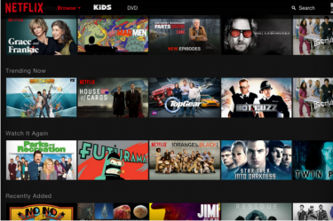
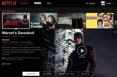
Netflix will be rolling out a new version of its web based player in June as the company looks to unify the interface of their web and app players.
The new design will do away with the previous carousel design in favour of a single page design with larger thumbnails. Thumbnails, when clicked on, will produce an overlay containing the meta-data for the show (description, ratings ...), without the need for a page refresh. The new design also allows viewers will be able to select and browse through genres with a single click.
The new web UI will mimic the design of the current Netflix smartphone and tablet app in look and feel, and is part of the streaming giant's efforts to unify the design of all of its player interfaces.
A small number of users have already received the update as part of live testing by Netflix, but the company plans to roll out the major change, the first since 2011, to all users worldwide during June.


Via The Verge